hero18
FREE

Want More?
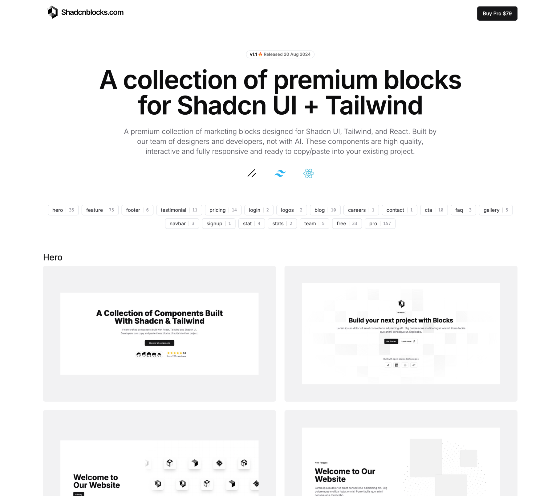
Shadcnblocks.com
A beautiful collection of premium block components for Shadcn UI & Tailwind. Try the free blocks.
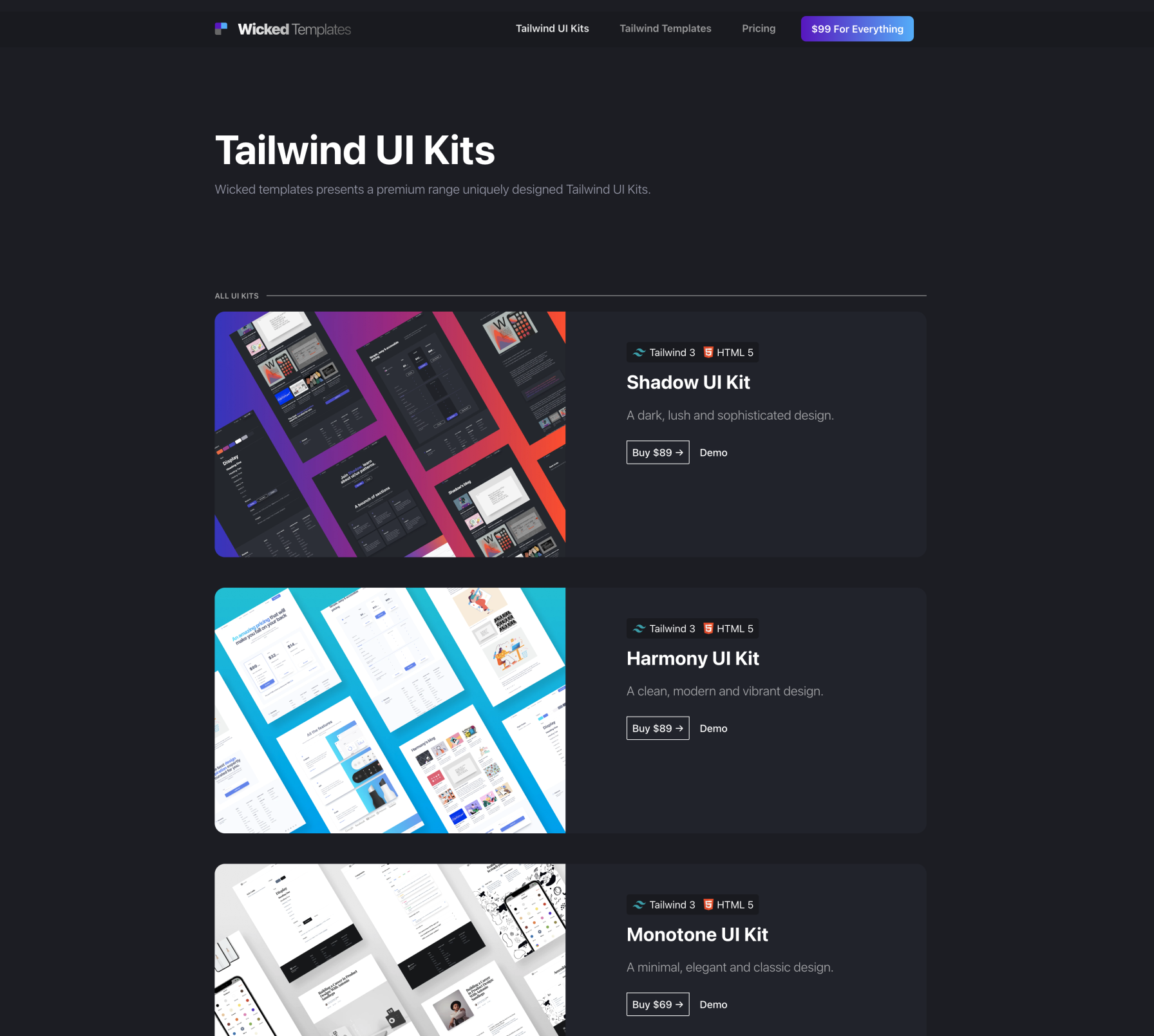
Wicked Templates
3 Massive Tailwind UI Kits; Shadow, Harmony & Monotone versions. From $99. Demo the UI Kits
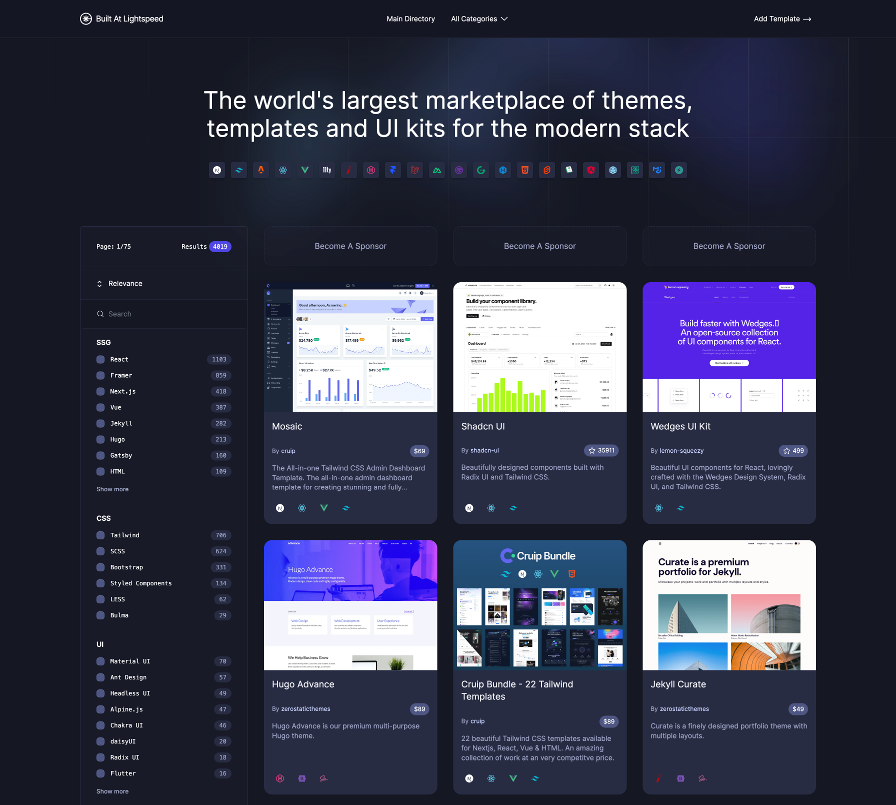
Built At Lightspeed
The worlds largest marketplace of themes for the modern stack. Browse 4000+ free templates.