<section>
<div class="container py-24">
<div class="relative h-[500px] flex-1">
<div class="absolute inset-0 flex size-full items-center justify-center overflow-hidden rounded-xl object-cover">
<img src="/images/placeholders/original/1600x1200-video.png" alt="video"
class="inline-block size-full max-w-full object-cover align-middle" />
<svg xmlns="http://www.w3.org/2000/svg" width="1em" height="1em" viewBox="0 0 24 24"
class="absolute z-20 size-14 text-white">
<path fill="currentColor"
d="m10.65 15.75l4.875-3.125q.35-.225.35-.625t-.35-.625L10.65 8.25q-.375-.25-.763-.038t-.387.663v6.25q0 .45.388.663t.762-.038M12 22q-2.075 0-3.9-.788t-3.175-2.137T2.788 15.9T2 12t.788-3.9t2.137-3.175T8.1 2.788T12 2t3.9.788t3.175 2.137T21.213 8.1T22 12t-.788 3.9t-2.137 3.175t-3.175 2.138T12 22">
</path>
</svg>
<span class="absolute inset-0 z-10 bg-black/50"></span>
</div>
</div>
<div class="grid grid-cols-2 gap-12 pt-12">
<div>
<h1 class="mb-8 flex max-w-6xl text-4xl font-semibold leading-none tracking-tight text-gray-800 md:text-6xl">
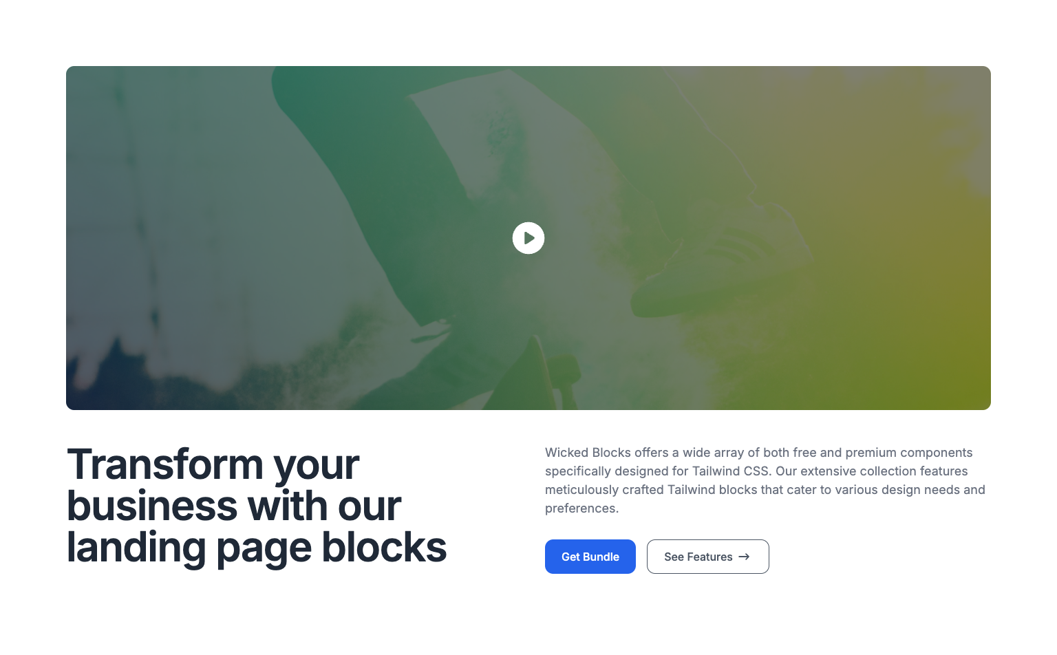
Transform your business with our landing page blocks
</h1>
</div>
<div>
<p class="text-lg leading-normal text-gray-500">
Wicked Blocks offers a wide array of both free and premium components
specifically designed for Tailwind CSS. Our extensive collection
features meticulously crafted Tailwind blocks that cater to various
design needs and preferences.
</p>
<div class="mt-8 flex justify-start gap-4">
<button
class="flex items-center rounded-xl bg-blue-600 px-5 py-3 text-center text-base font-medium text-white transition duration-500 ease-in-out hover:bg-blue-700 focus:outline-none focus:ring-2 focus:ring-blue-500 focus:ring-offset-2 lg:px-6">Get
Bundle</button>
<button
class="flex items-center rounded-xl border border-gray-600 px-5 py-3 text-center font-medium text-gray-600 transition duration-500 ease-in-out hover:bg-gray-100 focus:outline-none focus:ring-2 focus:ring-gray-500 focus:ring-offset-2 lg:px-6">See
Features<svg width="24" height="24" viewBox="0 0 24 24" class="ml-1 size-6">
<path fill="none" stroke="currentColor" stroke-linecap="round" stroke-linejoin="round" stroke-width="2"
d="M5 12h14m-4 4l4-4m-4-4l4 4"></path>
</svg></button>
</div>
</div>
</div>
</div>
</section>
