feature1
FREE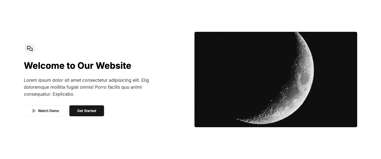
Short length headline.
Free and Premium themes, UI Kit's, templates and landing pages built with Tailwind CSS, HTML & Next.js.
<section class="py-32">
  <div class="container">
    <div class="grid items-center gap-8 lg:grid-cols-2">
      <div class="flex flex-col items-center text-center lg:items-start lg:text-left">
        <span class="flex size-12 items-center justify-center rounded-full bg-zinc-100"><svg
            xmlns="http://www.w3.org/2000/svg" width="24" height="24" viewBox="0 0 24 24" fill="none"
            stroke="currentColor" stroke-width="2" stroke-linecap="round" stroke-linejoin="round"
            class="lucide lucide-messages-square size-6">
            <path d="M14 9a2 2 0 0 1-2 2H6l-4 4V4c0-1.1.9-2 2-2h8a2 2 0 0 1 2 2z"></path>
            <path d="M18 9h2a2 2 0 0 1 2 2v11l-4-4h-6a2 2 0 0 1-2-2v-1"></path>
          </svg></span>
        <h1 class="my-6 text-pretty text-3xl font-bold lg:text-4xl">Welcome to Our Website</h1>
        <p class="mb-8 max-w-xl text-zinc-600 lg:text-lg">
          Lorem ipsum dolor sit amet consectetur adipisicing elit. Elig doloremque mollitia fugiat
          omnis! Porro facilis quo animi consequatur. Explicabo.
        </p>
        <div class="flex w-full flex-col justify-center gap-2 sm:flex-row lg:justify-start">
          <button
            class="inline-flex items-center justify-center whitespace-nowrap text-sm font-medium ring-offset-background transition-colors focus-visible:outline-none focus-visible:ring-2 focus-visible:ring-ring focus-visible:ring-offset-2 disabled:pointer-events-none disabled:opacity-50 border border-input bg-white hover:bg-zinc-100 hover:text-zinc-800 h-11 rounded-md px-8 w-full sm:w-auto">
            <svg xmlns="http://www.w3.org/2000/svg" width="24" height="24" viewBox="0 0 24 24" fill="none"
              stroke="currentColor" stroke-width="2" stroke-linecap="round" stroke-linejoin="round"
              class="lucide lucide-play mr-2 size-4">
              <polygon points="6 3 20 12 6 21 6 3"></polygon>
            </svg>Watch Demo</button><button
            class="inline-flex items-center justify-center whitespace-nowrap text-sm font-medium ring-offset-background transition-colors focus-visible:outline-none focus-visible:ring-2 focus-visible:ring-ring focus-visible:ring-offset-2 disabled:pointer-events-none disabled:opacity-50 bg-zinc-900 text-white hover:bg-zinc-900/90 h-11 rounded-md px-8 w-full sm:w-auto">
            Get Started
          </button>
        </div>
      </div>
      <img src="/images/placeholders/minima/placeholder-1.jpg" alt="placeholder hero"
        class="max-h-96 w-full rounded-md object-cover" />
    </div>
  </div>
</section>feature2
FREE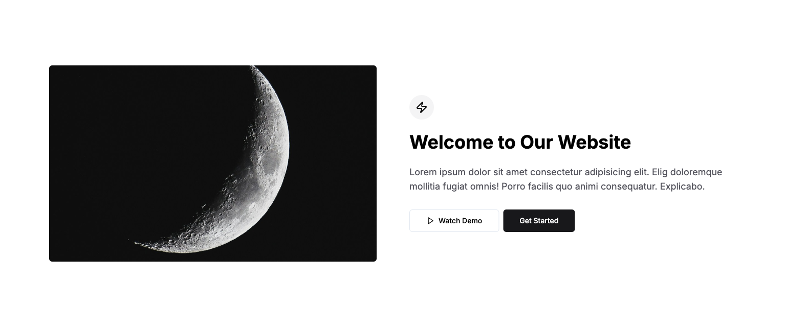
Short length headline.
Free and Premium themes, UI Kit's, templates and landing pages built with Tailwind CSS, HTML & Next.js.
Short length headline.
Free and Premium themes, UI Kit's, templates and landing pages built with Tailwind CSS, HTML & Next.js.
<section class="py-32">
  <div class="container">
    <div class="grid items-center gap-8 lg:grid-cols-2 lg:gap-16">
      <img src="/images/placeholders/minima/placeholder-1.jpg" alt="placeholder hero"
        class="max-h-96 w-full rounded-md object-cover" />
      <div class="flex flex-col items-center text-center lg:items-start lg:text-left">
        <span class="flex size-12 items-center justify-center rounded-full bg-zinc-100"><svg
            xmlns="http://www.w3.org/2000/svg" width="24" height="24" viewBox="0 0 24 24" fill="none"
            stroke="currentColor" stroke-width="2" stroke-linecap="round" stroke-linejoin="round"
            class="lucide lucide-zap size-6">
            <path
              d="M4 14a1 1 0 0 1-.78-1.63l9.9-10.2a.5.5 0 0 1 .86.46l-1.92 6.02A1 1 0 0 0 13 10h7a1 1 0 0 1 .78 1.63l-9.9 10.2a.5.5 0 0 1-.86-.46l1.92-6.02A1 1 0 0 0 11 14z">
            </path>
          </svg></span>
        <h1 class="my-6 text-pretty text-3xl font-bold lg:text-4xl">Welcome to Our Website</h1>
        <p class="mb-8 max-w-xl text-zinc-600 lg:max-w-none lg:text-lg">
          Lorem ipsum dolor sit amet consectetur adipisicing elit. Elig doloremque mollitia fugiat
          omnis! Porro facilis quo animi consequatur. Explicabo.
        </p>
        <div class="flex w-full flex-col justify-center gap-2 sm:flex-row lg:justify-start">
          <button
            class="inline-flex items-center justify-center whitespace-nowrap text-sm font-medium ring-offset-background transition-colors focus-visible:outline-none focus-visible:ring-2 focus-visible:ring-ring focus-visible:ring-offset-2 disabled:pointer-events-none disabled:opacity-50 border border-input bg-white hover:bg-zinc-100 hover:text-zinc-800 h-11 rounded-md px-8 w-full sm:w-auto">
            <svg xmlns="http://www.w3.org/2000/svg" width="24" height="24" viewBox="0 0 24 24" fill="none"
              stroke="currentColor" stroke-width="2" stroke-linecap="round" stroke-linejoin="round"
              class="lucide lucide-play mr-2 size-4">
              <polygon points="6 3 20 12 6 21 6 3"></polygon>
            </svg>Watch Demo</button><button
            class="inline-flex items-center justify-center whitespace-nowrap text-sm font-medium ring-offset-background transition-colors focus-visible:outline-none focus-visible:ring-2 focus-visible:ring-ring focus-visible:ring-offset-2 disabled:pointer-events-none disabled:opacity-50 bg-zinc-900 text-white hover:bg-zinc-900/90 h-11 rounded-md px-8 w-full sm:w-auto">
            Get Started
          </button>
        </div>
      </div>
    </div>
  </div>
</section>feature3
FREE
Short length headline.
Free and Premium themes, UI Kit's, templates and landing pages built with Tailwind CSS, HTML & Next.js.
Short length headline.
Free and Premium themes, UI Kit's, templates and landing pages built with Tailwind CSS, HTML & Next.js.
Short length headline.
Free and Premium themes, UI Kit's, templates and landing pages built with Tailwind CSS, HTML & Next.js.
<section class="py-32">
  <div class="container">
    <div class="mx-auto flex max-w-5xl flex-col items-center gap-6 text-center">
      <h1 class="mb-6 text-pretty text-4xl font-semibold lg:text-5xl">
        This is where your feature goes
      </h1>
      <div class="mt-10 grid grid-cols-1 place-items-center gap-8 sm:grid-cols-2 lg:grid-cols-3">
        <div class="rounded-lg border bg-card text-card-foreground shadow-sm">
          <div class="flex flex-col space-y-1.5 p-6 pb-1">
            <svg xmlns="http://www.w3.org/2000/svg" width="24" height="24" viewBox="0 0 24 24" fill="none"
              stroke="currentColor" stroke-width="1" stroke-linecap="round" stroke-linejoin="round"
              class="lucide lucide-code size-4">
              <polyline points="16 18 22 12 16 6"></polyline>
              <polyline points="8 6 2 12 8 18"></polyline>
            </svg>
          </div>
          <div class="p-6 pt-0 text-left">
            <h2 class="text-lg font-semibold mb-1">Card Title</h2>
            <p class="text-zinc-600 leading-snug">
              Lorem ipsum dolor sit amet consectetur.
            </p>
          </div>
          <div class="flex items-center p-6 pt-0 justify-end pb-0 pr-0">
            <img class="h-40 w-full rounded-tl-md object-cover object-center"
              src="/images/placeholders/minima/placeholder-1.jpg" alt="placeholder" />
          </div>
        </div>
        <div class="rounded-lg border bg-card text-card-foreground shadow-sm">
          <div class="flex flex-col space-y-1.5 p-6 pb-1">
            <svg xmlns="http://www.w3.org/2000/svg" width="24" height="24" viewBox="0 0 24 24" fill="none"
              stroke="currentColor" stroke-width="1" stroke-linecap="round" stroke-linejoin="round"
              class="lucide lucide-play size-4">
              <polygon points="6 3 20 12 6 21 6 3"></polygon>
            </svg>
          </div>
          <div class="p-6 pt-0 text-left">
            <h2 class="text-lg font-semibold mb-1">Card Title</h2>
            <p class="text-zinc-600 leading-snug">
              Lorem ipsum dolor sit amet consectetur.
            </p>
          </div>
          <div class="flex items-center p-6 pt-0 justify-end pb-0 pr-0">
            <img class="h-40 w-full rounded-tl-md object-cover object-center"
              src="/images/placeholders/minima/placeholder-2.jpg" alt="placeholder" />
          </div>
        </div>
        <div class="rounded-lg border bg-card text-card-foreground shadow-sm">
          <div class="flex flex-col space-y-1.5 p-6 pb-1">
            <svg xmlns="http://www.w3.org/2000/svg" width="24" height="24" viewBox="0 0 24 24" fill="none"
              stroke="currentColor" stroke-width="1" stroke-linecap="round" stroke-linejoin="round"
              class="lucide lucide-git-branch size-4">
              <line x1="6" x2="6" y1="3" y2="15"></line>
              <circle cx="18" cy="6" r="3"></circle>
              <circle cx="6" cy="18" r="3"></circle>
              <path d="M18 9a9 9 0 0 1-9 9"></path>
            </svg>
          </div>
          <div class="p-6 pt-0 text-left">
            <h2 class="text-lg font-semibold mb-1">Card Title</h2>
            <p class="text-zinc-600 leading-snug">
              Lorem ipsum dolor sit amet consectetur.
            </p>
          </div>
          <div class="flex items-center p-6 pt-0 justify-end pb-0 pr-0">
            <img class="h-40 w-full rounded-tl-md object-cover object-center"
              src="/images/placeholders/minima/placeholder-3.jpg" alt="placeholder" />
          </div>
        </div>
        <div class="rounded-lg border bg-card text-card-foreground shadow-sm">
          <div class="flex flex-col space-y-1.5 p-6 pb-1">
            <svg xmlns="http://www.w3.org/2000/svg" width="24" height="24" viewBox="0 0 24 24" fill="none"
              stroke="currentColor" stroke-width="1" stroke-linecap="round" stroke-linejoin="round"
              class="lucide lucide-list size-4">
              <line x1="8" x2="21" y1="6" y2="6"></line>
              <line x1="8" x2="21" y1="12" y2="12"></line>
              <line x1="8" x2="21" y1="18" y2="18"></line>
              <line x1="3" x2="3.01" y1="6" y2="6"></line>
              <line x1="3" x2="3.01" y1="12" y2="12"></line>
              <line x1="3" x2="3.01" y1="18" y2="18"></line>
            </svg>
          </div>
          <div class="p-6 pt-0 text-left">
            <h2 class="text-lg font-semibold mb-1">Card Title</h2>
            <p class="text-zinc-600 leading-snug">
              Lorem ipsum dolor sit amet consectetur.
            </p>
          </div>
          <div class="flex items-center p-6 pt-0 justify-end pb-0 pr-0">
            <img class="h-40 w-full rounded-tl-md object-cover object-center"
              src="/images/placeholders/minima/placeholder-4.jpg" alt="placeholder" />
          </div>
        </div>
        <div class="rounded-lg border bg-card text-card-foreground shadow-sm">
          <div class="flex flex-col space-y-1.5 p-6 pb-1">
            <svg xmlns="http://www.w3.org/2000/svg" width="24" height="24" viewBox="0 0 24 24" fill="none"
              stroke="currentColor" stroke-width="1" stroke-linecap="round" stroke-linejoin="round"
              class="lucide lucide-wand-sparkles size-4">
              <path
                d="m21.64 3.64-1.28-1.28a1.21 1.21 0 0 0-1.72 0L2.36 18.64a1.21 1.21 0 0 0 0 1.72l1.28 1.28a1.2 1.2 0 0 0 1.72 0L21.64 5.36a1.2 1.2 0 0 0 0-1.72">
              </path>
              <path d="m14 7 3 3"></path>
              <path d="M5 6v4"></path>
              <path d="M19 14v4"></path>
              <path d="M10 2v2"></path>
              <path d="M7 8H3"></path>
              <path d="M21 16h-4"></path>
              <path d="M11 3H9"></path>
            </svg>
          </div>
          <div class="p-6 pt-0 text-left">
            <h2 class="text-lg font-semibold mb-1">Card Title</h2>
            <p class="text-zinc-600 leading-snug">
              Lorem ipsum dolor sit amet consectetur.
            </p>
          </div>
          <div class="flex items-center p-6 pt-0 justify-end pb-0 pr-0">
            <img class="h-40 w-full rounded-tl-md object-cover object-center"
              src="/images/placeholders/minima/placeholder-5.jpg" alt="placeholder" />
          </div>
        </div>
        <div class="rounded-lg border bg-card text-card-foreground shadow-sm">
          <div class="flex flex-col space-y-1.5 p-6 pb-1">
            <svg xmlns="http://www.w3.org/2000/svg" width="24" height="24" viewBox="0 0 24 24" fill="none"
              stroke="currentColor" stroke-width="1" stroke-linecap="round" stroke-linejoin="round"
              class="lucide lucide-sparkles size-4">
              <path
                d="M9.937 15.5A2 2 0 0 0 8.5 14.063l-6.135-1.582a.5.5 0 0 1 0-.962L8.5 9.936A2 2 0 0 0 9.937 8.5l1.582-6.135a.5.5 0 0 1 .963 0L14.063 8.5A2 2 0 0 0 15.5 9.937l6.135 1.581a.5.5 0 0 1 0 .964L15.5 14.063a2 2 0 0 0-1.437 1.437l-1.582 6.135a.5.5 0 0 1-.963 0z">
              </path>
              <path d="M20 3v4"></path>
              <path d="M22 5h-4"></path>
              <path d="M4 17v2"></path>
              <path d="M5 18H3"></path>
            </svg>
          </div>
          <div class="p-6 pt-0 text-left">
            <h2 class="text-lg font-semibold mb-1">Card Title</h2>
            <p class="text-zinc-600 leading-snug">
              Lorem ipsum dolor sit amet consectetur.
            </p>
          </div>
          <div class="flex items-center p-6 pt-0 justify-end pb-0 pr-0">
            <img class="h-40 w-full rounded-tl-md object-cover object-center"
              src="/images/placeholders/minima/placeholder-6.jpg" alt="placeholder" />
          </div>
        </div>
      </div>
    </div>
  </div>
</section>feature4
FREE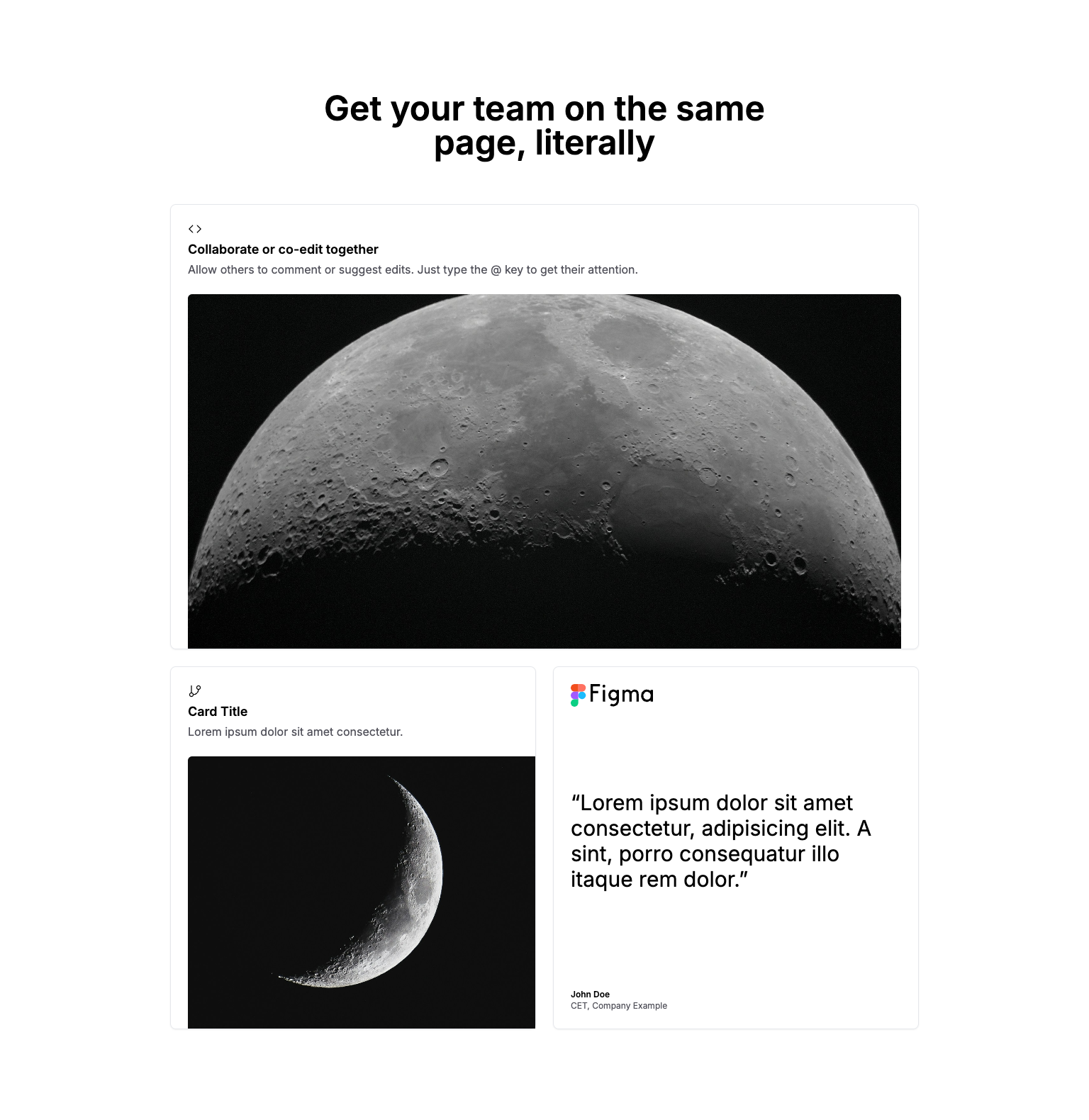
Short length headline.
Free and Premium themes, UI Kit's, templates and landing pages built with Tailwind CSS, HTML & Next.js.
Short length headline.
Free and Premium themes, UI Kit's, templates and landing pages built with Tailwind CSS, HTML & Next.js.
Short length headline.
Free and Premium themes, UI Kit's, templates and landing pages built with Tailwind CSS, HTML & Next.js.
<section class="py-32">
  <div class="container">
    <div class="mx-auto xl:px-36">
      <h1 class="mx-auto mb-16 max-w-screen-sm text-pretty text-center text-4xl font-semibold lg:text-5xl">
        Get your team on the same page, literally
      </h1>
      <div class="mt-10 flex flex-col gap-6">
        <div class="rounded-lg border bg-card text-card-foreground shadow-sm">
          <div class="flex flex-col space-y-1.5 p-6 pb-1">
            <svg xmlns="http://www.w3.org/2000/svg" width="24" height="24" viewBox="0 0 24 24" fill="none"
              stroke="currentColor" stroke-width="1.5" stroke-linecap="round" stroke-linejoin="round"
              class="lucide lucide-code size-5">
              <polyline points="16 18 22 12 16 6"></polyline>
              <polyline points="8 6 2 12 8 18"></polyline>
            </svg>
          </div>
          <div class="p-6 pt-0 text-left">
            <h2 class="mb-1 text-lg font-semibold">Collaborate or co-edit together</h2>
            <p class="leading-snug text-zinc-600">
              Allow others to comment or suggest edits. Just type the @ key to get their attention.
            </p>
          </div>
          <div class="flex items-center p-6 pt-0 justify-end pb-0">
            <img class="h-[500px] w-full rounded-t-md object-cover object-center"
              src="/images/placeholders/minima/placeholder-wide-1.jpg" alt="placeholder" />
          </div>
        </div>
        <div class="flex flex-col gap-6 md:flex-row">
          <div class="rounded-lg border bg-card text-card-foreground shadow-sm w-full">
            <div class="flex flex-col space-y-1.5 p-6 pb-1">
              <svg xmlns="http://www.w3.org/2000/svg" width="24" height="24" viewBox="0 0 24 24" fill="none"
                stroke="currentColor" stroke-width="1.5" stroke-linecap="round" stroke-linejoin="round"
                class="lucide lucide-git-branch size-5">
                <line x1="6" x2="6" y1="3" y2="15"></line>
                <circle cx="18" cy="6" r="3"></circle>
                <circle cx="6" cy="18" r="3"></circle>
                <path d="M18 9a9 9 0 0 1-9 9"></path>
              </svg>
            </div>
            <div class="p-6 pt-0 text-left">
              <h2 class="mb-1 text-lg font-semibold">Card Title</h2>
              <p class="leading-snug text-zinc-600">
                Lorem ipsum dolor sit amet consectetur.
              </p>
            </div>
            <div class="flex items-center p-6 pt-0 justify-end pb-0 pr-0">
              <img class="h-full max-h-96 w-full rounded-tl-md object-cover object-center"
                src="/images/placeholders/minima/placeholder-1.jpg" alt="placeholder" />
            </div>
          </div>
          <div
            class="rounded-lg border bg-card text-card-foreground shadow-sm flex w-full flex-col justify-between gap-10 md:gap-20">
            <div class="flex flex-col space-y-1.5 p-6 items-start pb-1">
              <img class="h-8" src="/images/placeholders/logos/figma.svg" alt="" />
            </div>
            <div class="p-6 pt-0 text-left">
              <q class="text-2xl md:text-3xl">Lorem ipsum dolor sit amet consectetur, adipisicing elit. A sint, porro
                consequatur
                illo itaque rem dolor.</q>
            </div>
            <div class="flex p-6 pt-0 flex-col items-start text-xs">
              <p class="font-semibold">John Doe</p>
              <p class="text-zinc-600">CET, Company Example</p>
            </div>
          </div>
        </div>
      </div>
    </div>
  </div>
</section>feature5
FREE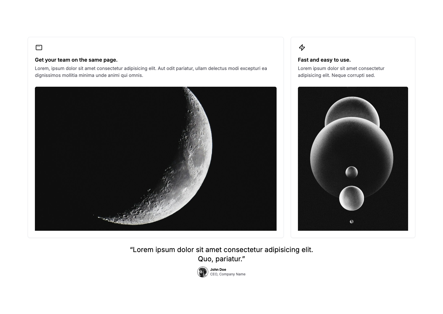
Short headline.
Free and Premium themes, UI Kit's, templates and landing pages built with Tailwind CSS, HTML & Next.js.
Short headline.
Free and Premium themes, UI Kit's, templates and landing pages built with Tailwind CSS, HTML & Next.js.
Short headline.
Free and Premium themes, UI Kit's, templates and landing pages built with Tailwind CSS, HTML & Next.js.
<section class="py-32">
  <div class="container">
    <div class="grid gap-6 md:grid-cols-2 lg:grid-cols-3">
      <div class="rounded-lg border bg-card text-card-foreground shadow-sm p-6 lg:col-span-2">
        <svg xmlns="http://www.w3.org/2000/svg" width="24" height="24" viewBox="0 0 24 24" fill="none"
          stroke="currentColor" stroke-width="2" stroke-linecap="round" stroke-linejoin="round"
          class="lucide lucide-app-window-mac mb-1 w-7">
          <rect width="20" height="16" x="2" y="4" rx="2"></rect>
          <path d="M6 8h.01"></path>
          <path d="M10 8h.01"></path>
          <path d="M14 8h.01"></path>
        </svg>
        <div class="text-left">
          <h2 class="mb-1 mt-4 text-lg font-semibold">Get your team on the same page.</h2>
          <p class="text-zinc-600">
            Lorem, ipsum dolor sit amet consectetur adipisicing elit. Aut odit pariatur, ullam
            delectus modi excepturi ea dignissimos mollitia minima unde animi qui omnis.
          </p>
        </div>
        <div class="mt-7">
          <img class="aspect-square max-h-[500px] w-full rounded-t-md object-cover object-center"
            src="/images/placeholders/minima/placeholder-1.jpg" alt="placeholder" />
        </div>
      </div>
      <div class="rounded-lg border bg-card text-card-foreground shadow-sm flex flex-col justify-between p-6">
        <div class="text-left">
          <svg xmlns="http://www.w3.org/2000/svg" width="24" height="24" viewBox="0 0 24 24" fill="none"
            stroke="currentColor" stroke-width="2" stroke-linecap="round" stroke-linejoin="round"
            class="lucide lucide-zap mb-1 w-7">
            <path
              d="M4 14a1 1 0 0 1-.78-1.63l9.9-10.2a.5.5 0 0 1 .86.46l-1.92 6.02A1 1 0 0 0 13 10h7a1 1 0 0 1 .78 1.63l-9.9 10.2a.5.5 0 0 1-.86-.46l1.92-6.02A1 1 0 0 0 11 14z">
            </path>
          </svg>
          <h2 class="mb-1 mt-4 text-lg font-semibold">Fast and easy to use.</h2>
          <p class="text-zinc-600">
            Lorem ipsum dolor sit amet consectetur adipisicing elit. Neque corrupti sed.
          </p>
        </div>
        <img class="mt-7 aspect-square rounded-t-md object-cover lg:aspect-auto lg:h-full"
          src="/images/placeholders/minima/placeholder-2.jpg" alt="placeholder" />
      </div>
    </div>
    <div class="mt-6 flex flex-col items-center gap-3">
      <q class="max-w-2xl text-center text-2xl">Lorem ipsum dolor sit amet consectetur adipisicing elit. Quo,
        pariatur.</q>
      <div class="flex flex-col items-center gap-2 leading-5 sm:flex-row">
        <img src="/images/placeholders/minima/avatar-bw-1.jpg"
          class="relative flex shrink-0 overflow-hidden size-9 rounded-full ring-zinc-800 ring-1 ring-input" />
        <div class="text-center text-xs sm:text-left">
          <p class="font-bold">John Doe</p>
          <p class="text-zinc-600">CEO, Company Name</p>
        </div>
      </div>
    </div>
  </div>
</section>